


A bank full of personality and heart gets a rebrand to match.
Brand Strategy
|
Identity
|
Print
|
Digital
|
Video
Asset Size
1B
Locations
Massachusetts, New Hampshire
Branches
6
Employees
107
Established
1891
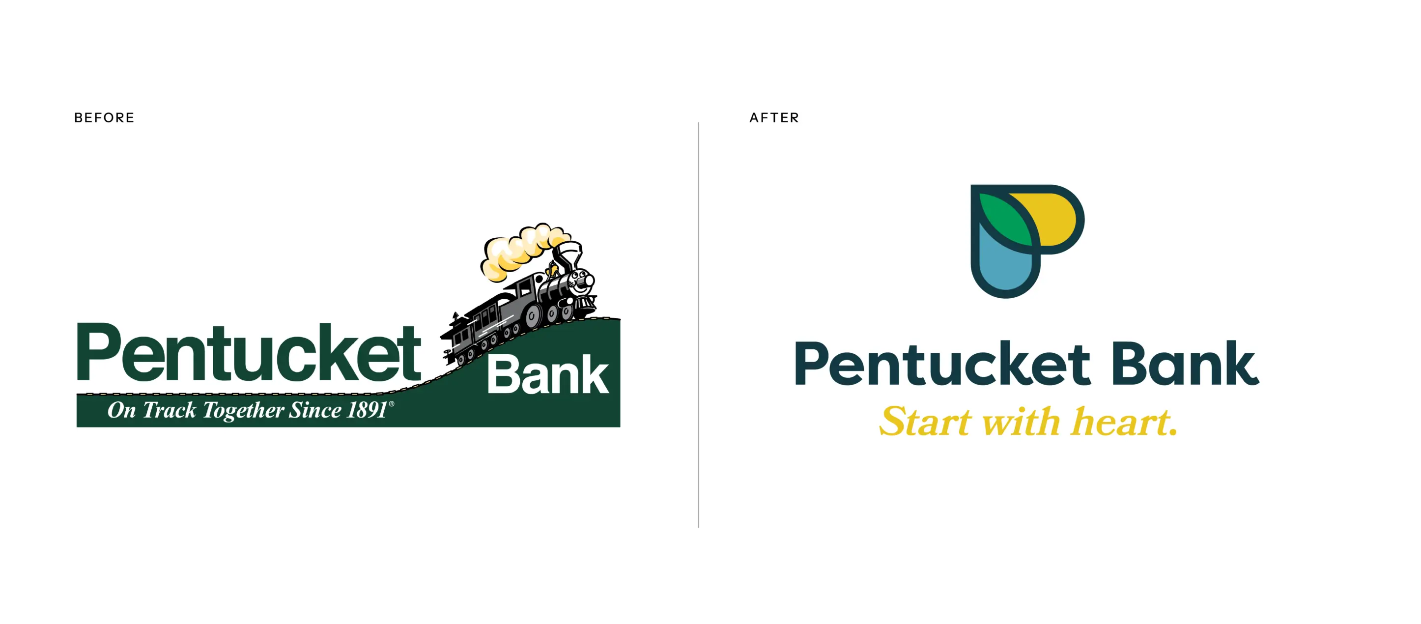
Pentucket Bank has a strong history of serving the Haverhill, MA community (130-plus years). They’ve invested time, money, and resources into being a strong brand in this market with engaged employees and loyal customers. The bank is known for its commitment to the community and for having great people who provide excellent customer service. The bank’s existing train logo was a nod to the story of “The Little Engine That Could.” For many years, Pentucket Bank was “the little bank that could.” Fast forward to today, and the bank has $1 billion in assets and over 100 employees—and serves two communities in two states. This was no longer the little bank that could; this was the little bank that did. Having expanded its capabilities and market share, the bank was ready to compete for larger relationships, against much larger competitors. It was time to advance the look of the brand and create relevant messaging that reflected the bank’s personality, capabilities, and values.
Brand discovery revealed strengths of the bank’s brand along with opportunities for improvement. Since 1891, Pentucket Bank has had a heart for helping its customers and communities grow bigger, better, and brighter. They are committed to serving their communities and provide exceptional service because they truly care. On the challenges side, the bank’s longevity, reluctance to change, and conservative nature gave the appearance of the bank seeming to be outdated and lacking in innovation—which was especially concerning as the bank wanted to attract a younger demographic. Additionally, growth and change in leadership had led to struggles with internal communication and many employees feeling siloed. Finally, brand awareness in the bank’s newer markets was significantly low. You can be the best at what you do, but if people don’t know you exist, you can’t grow.
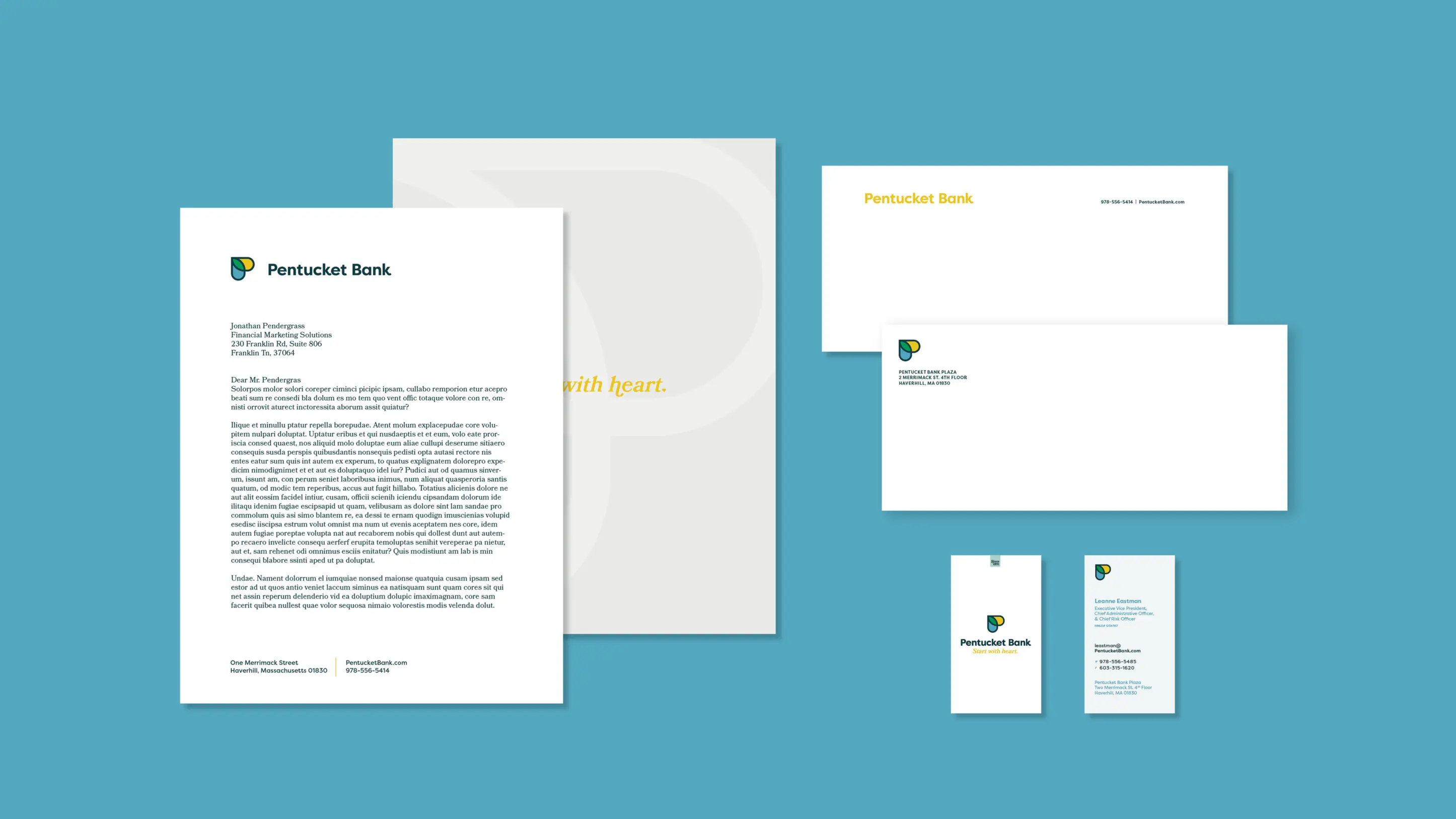
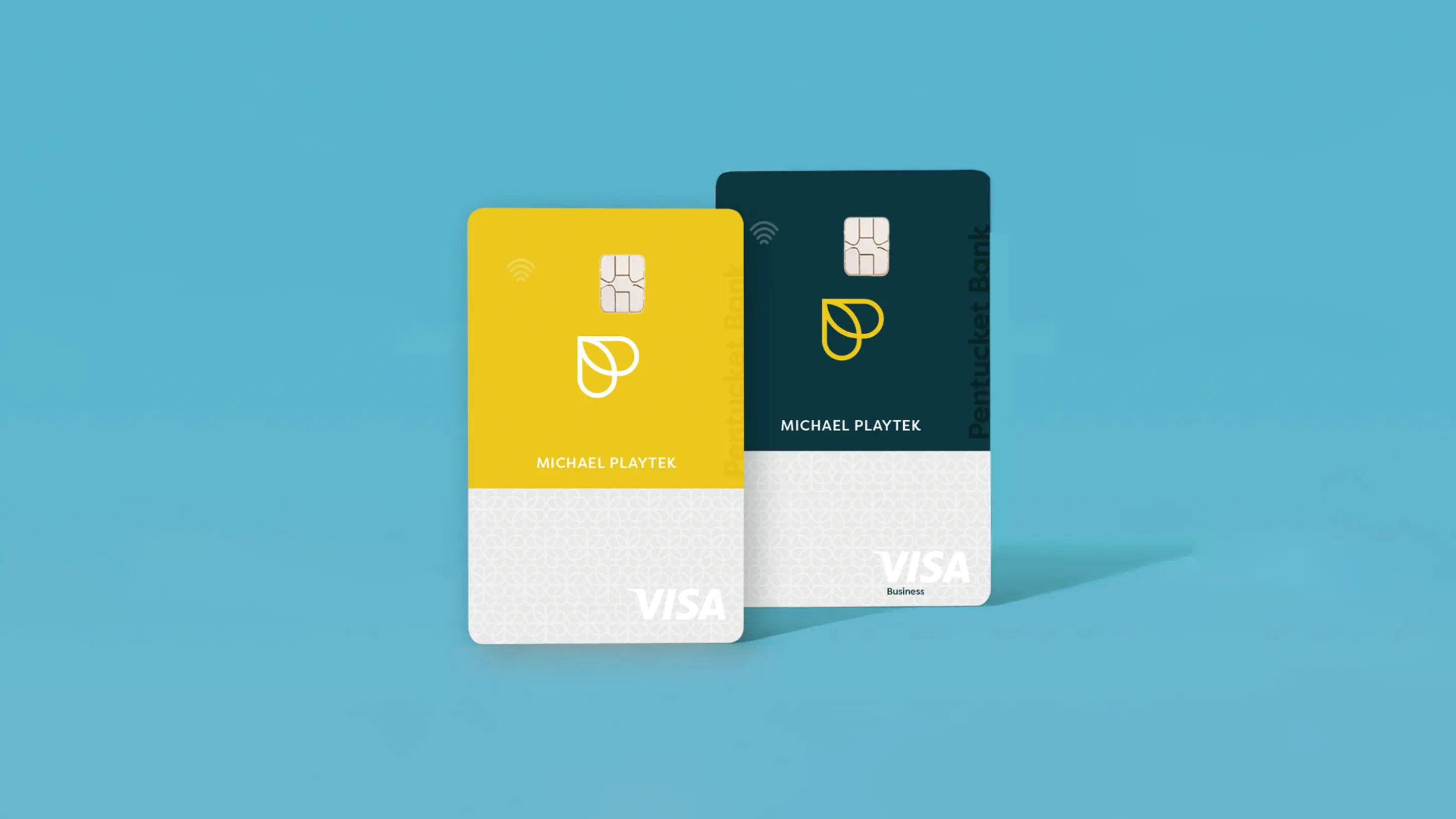
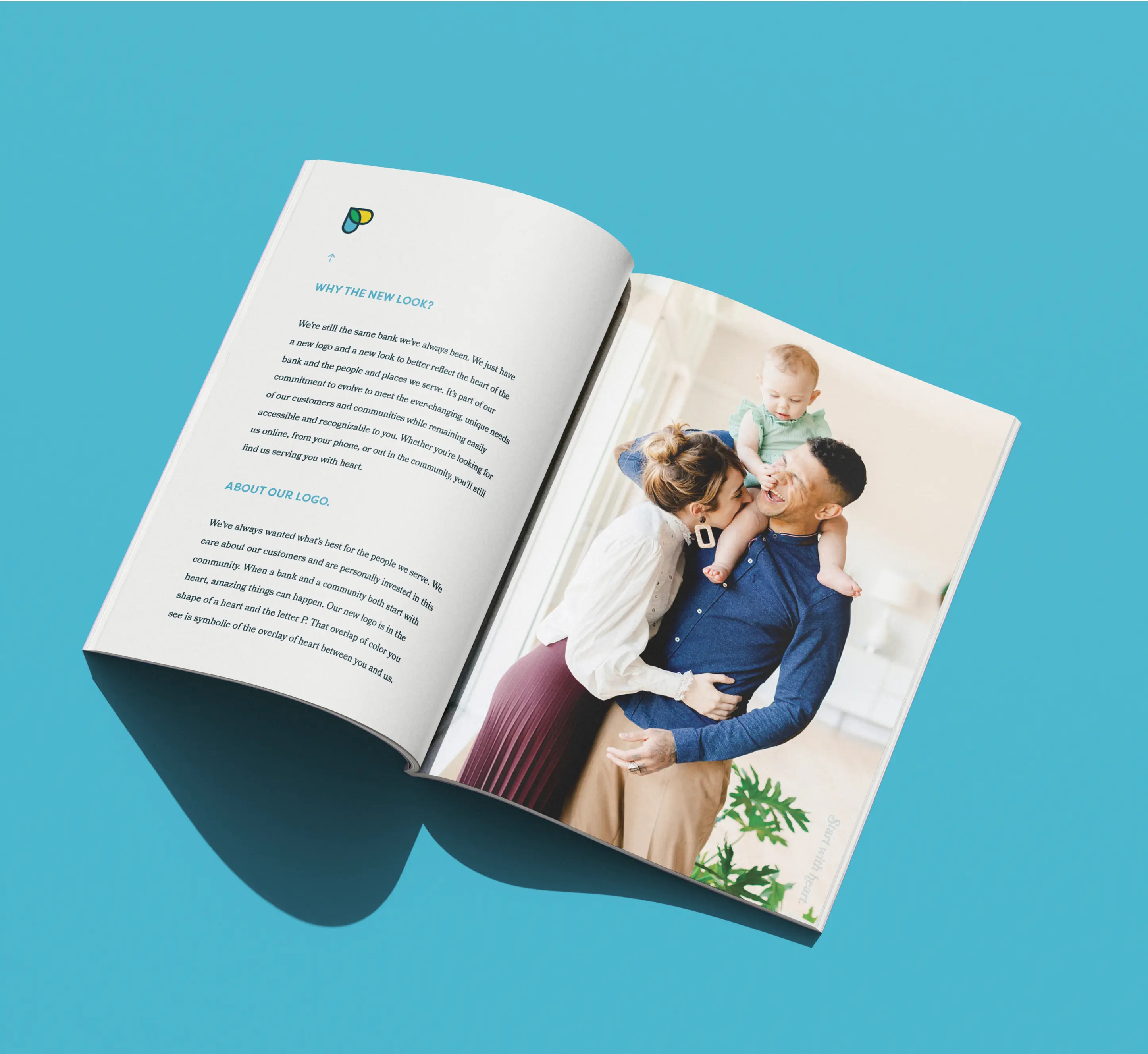
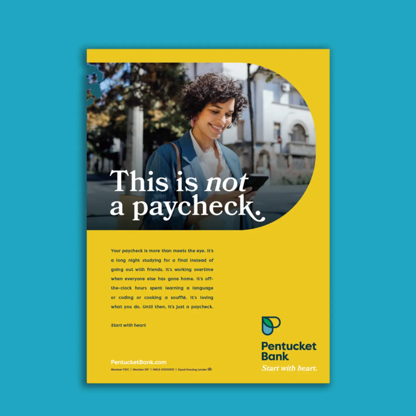
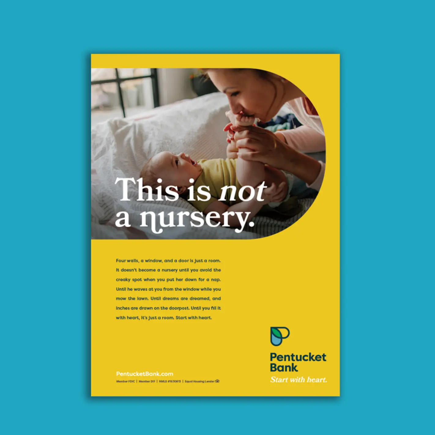
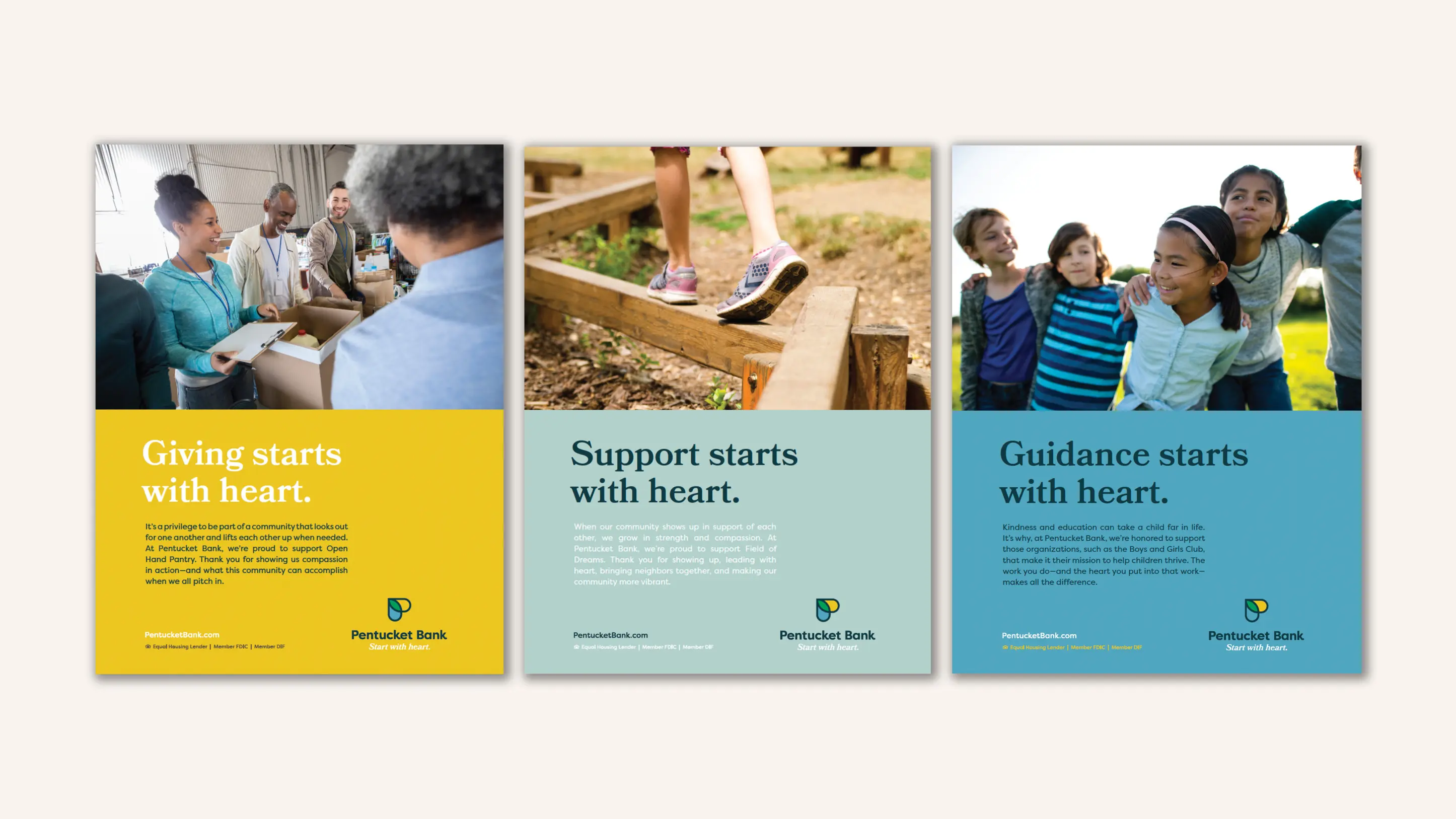
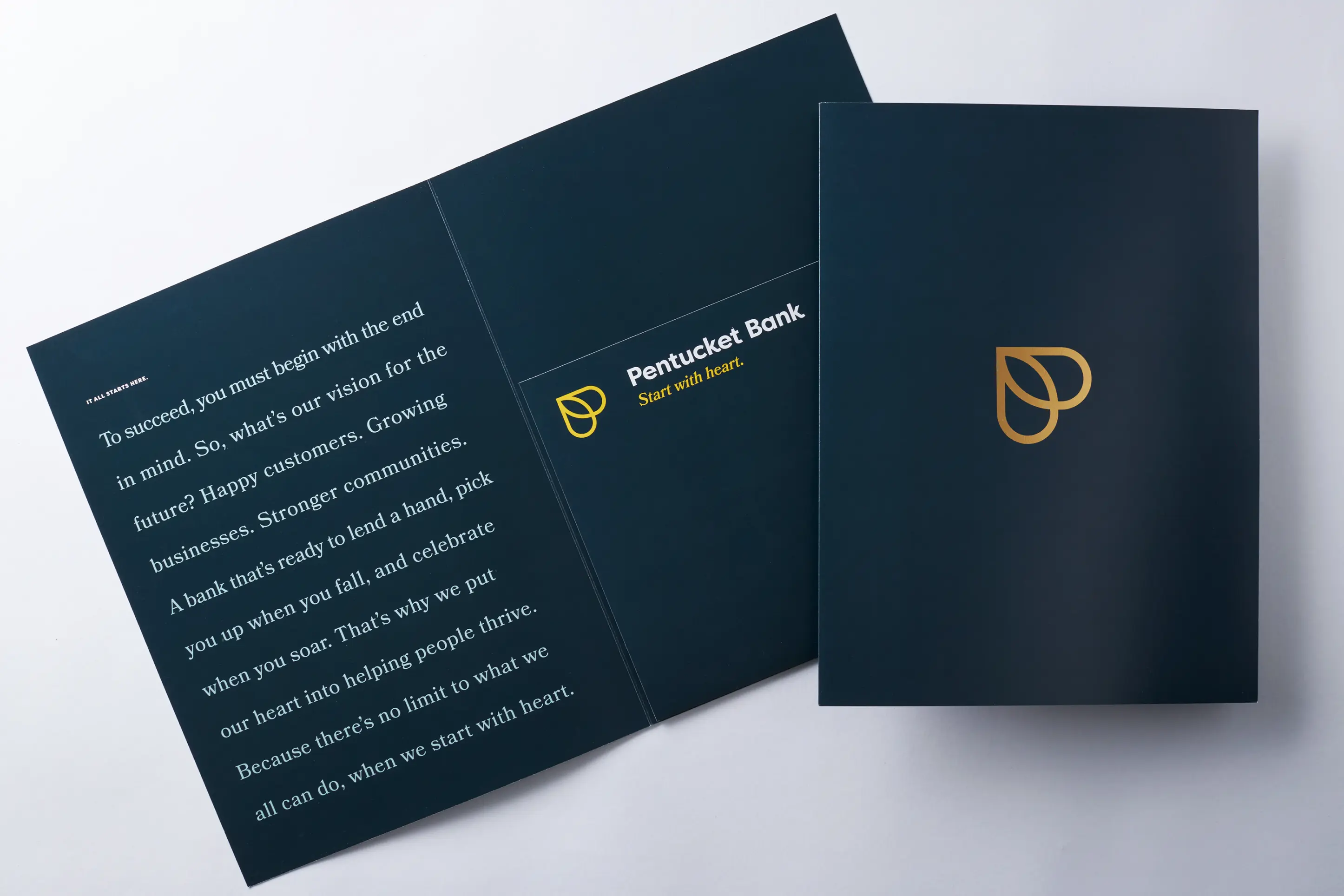
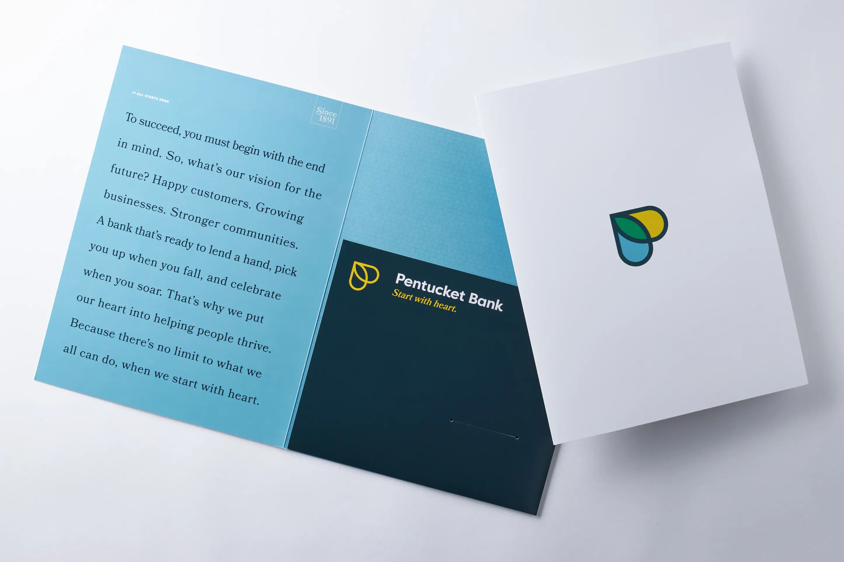
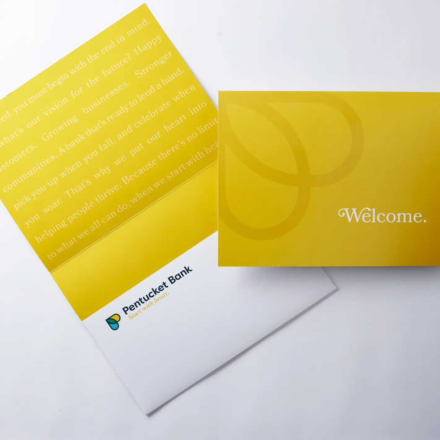
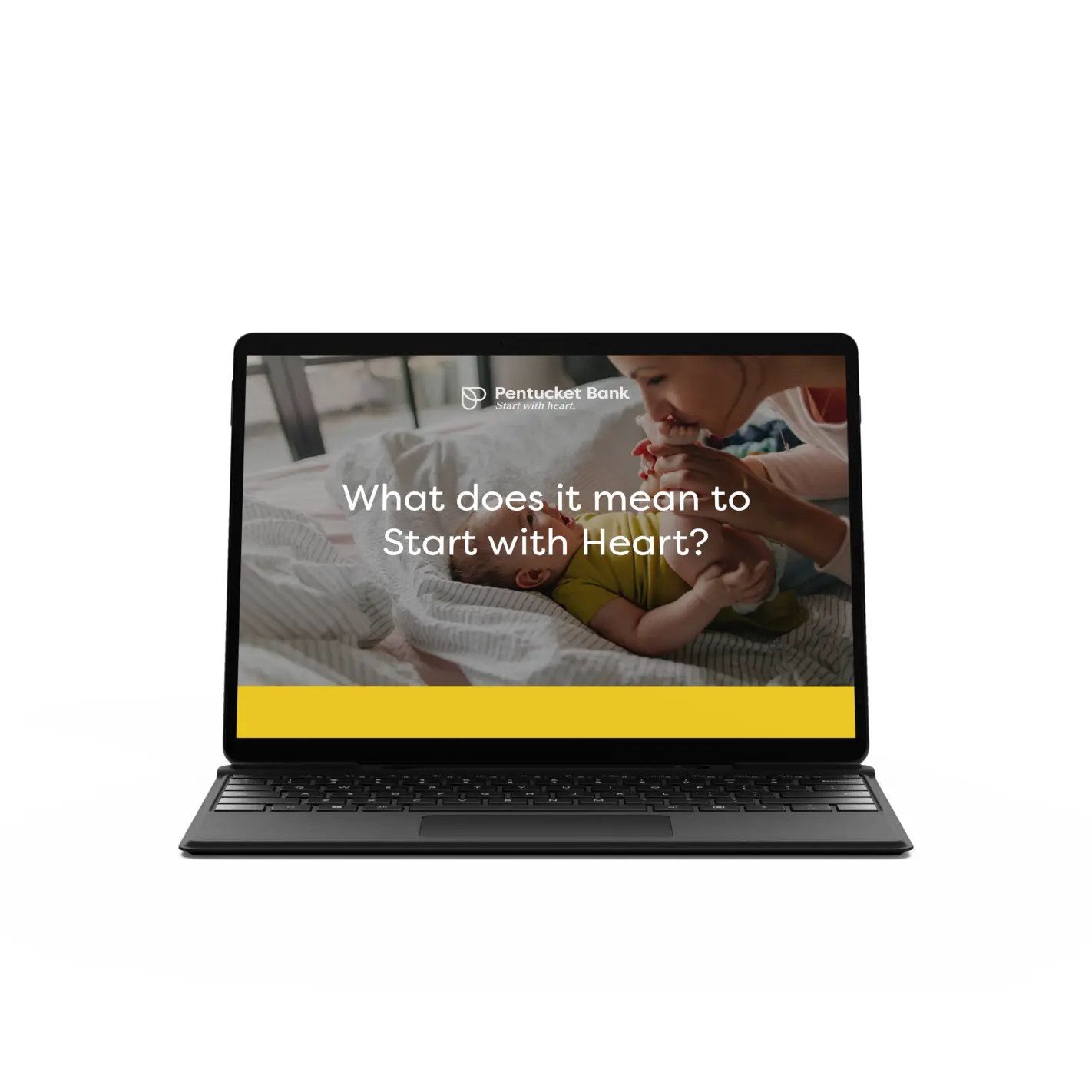
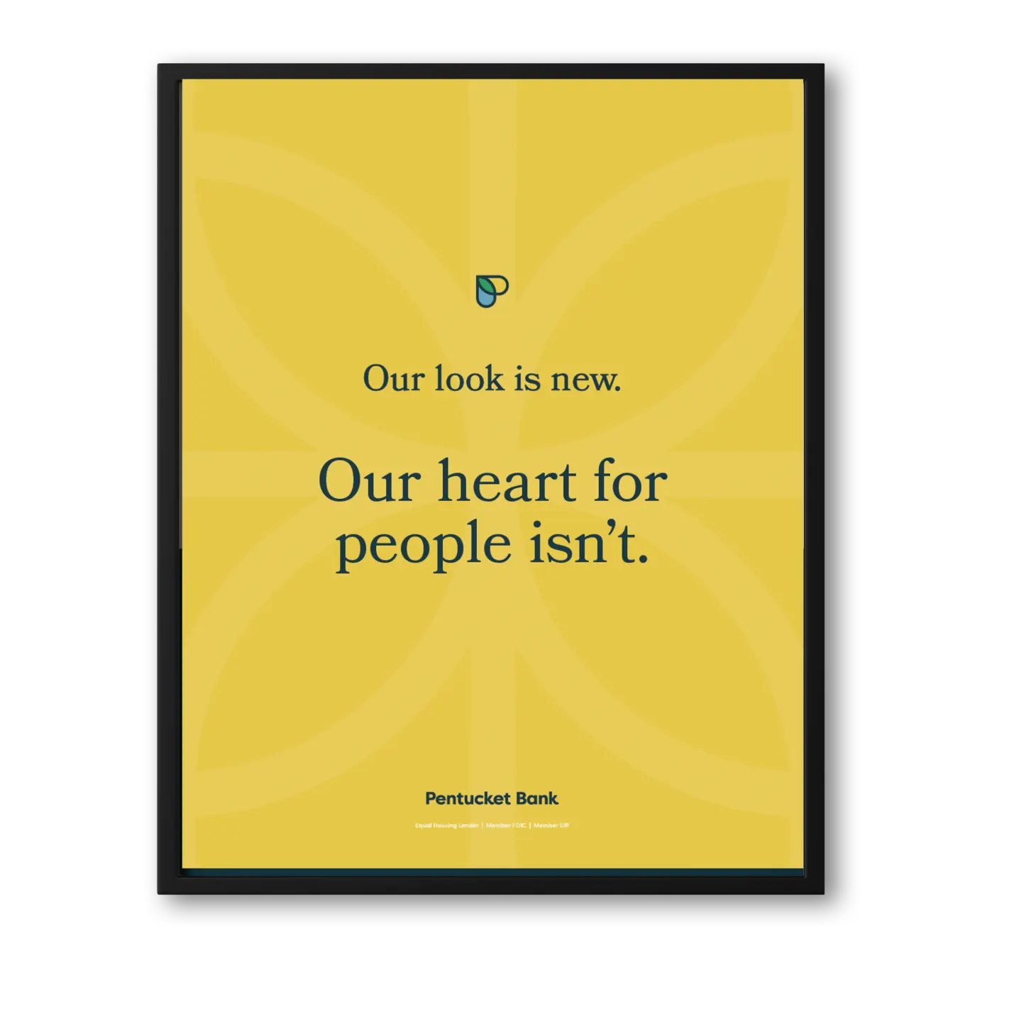
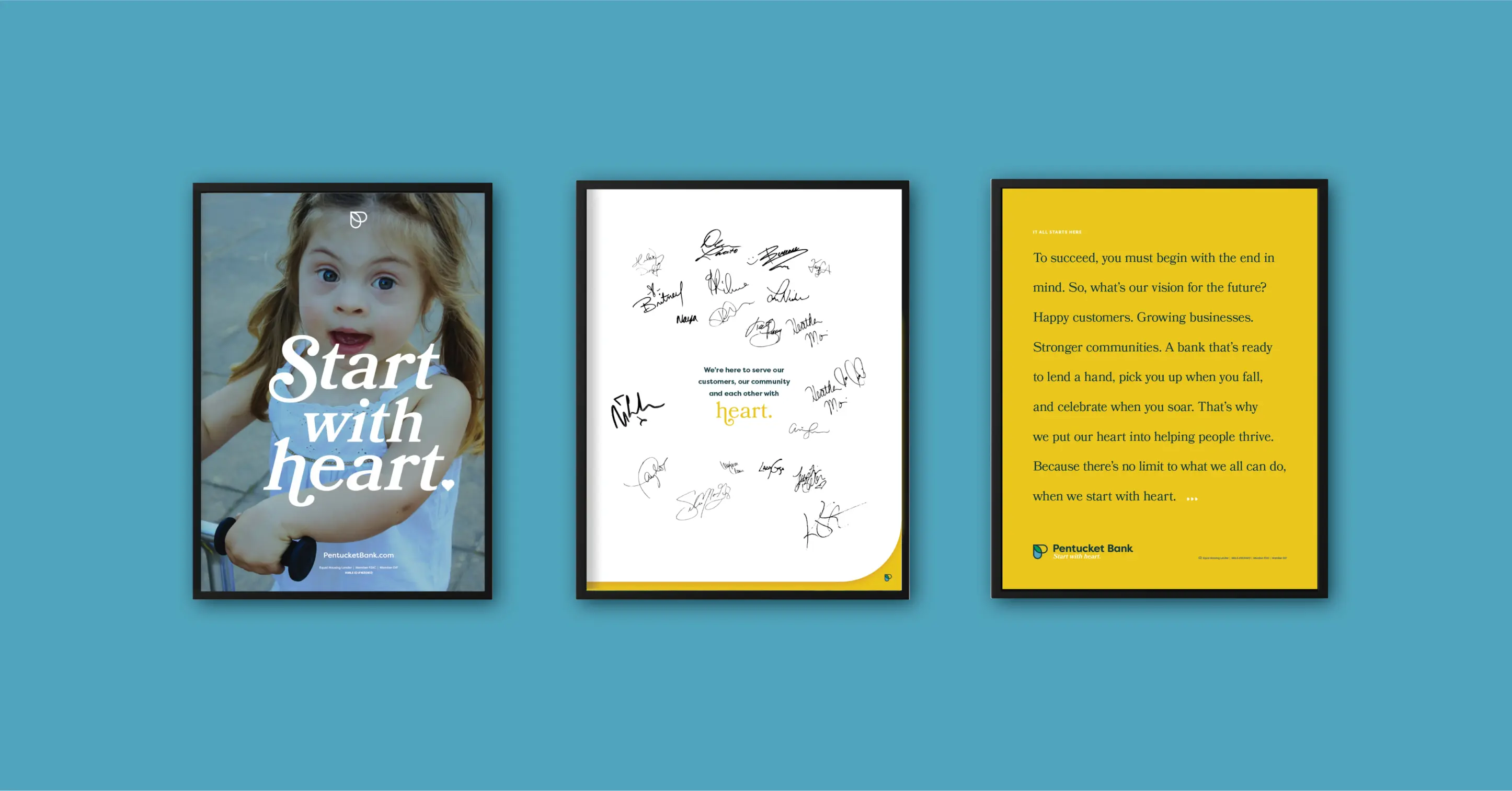
The name Pentucket Bank would stay, as there was plenty of positive equity in that name. However, the bank needed a new brand identity that would accurately reflect its ability to serve and compete, generate a positive and relevant feeling, and stay true to its heart-driven mission of service. The tagline “Start With Heart” encapsulates the purpose of the bank and its core values, which have never wavered from the very start. We created a new logo in the shape of a heart and the letter P with an overlap of color, which symbolizes the overlay of heart between the bank and its customers. The bank’s clearly defined brand, which includes a fresh look and relatable messaging—along with an internal and external launch—has created a new sense of energy and purpose in which employees feel like their work is making a difference; there’s renewed interest and engagement in its markets—and renewed focus on the impact Pentucket Bank has on the communities and people it serves. The new brand identity has become a core part of the organization’s vision, values and business practices, providing the foundation for all future branding, marketing and advertising activities.

